
今天和大家分享4个PPT图表美化小技巧,可以为你的PPT增添不一样的色彩,一起来看看吧!
一、柱状图的美化
无论哪一种图表,只要颜色填充对了,效果立马提升
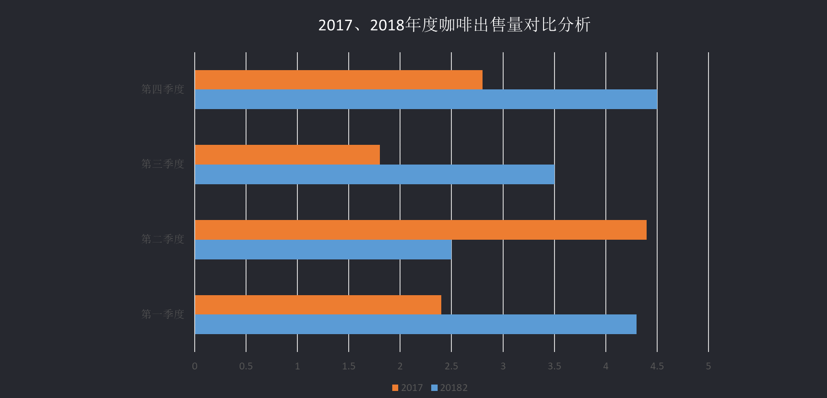
比如原来插入这样一个图表,删掉不要的表格标题、图例等之后,得到的原始表格。


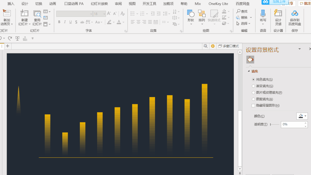
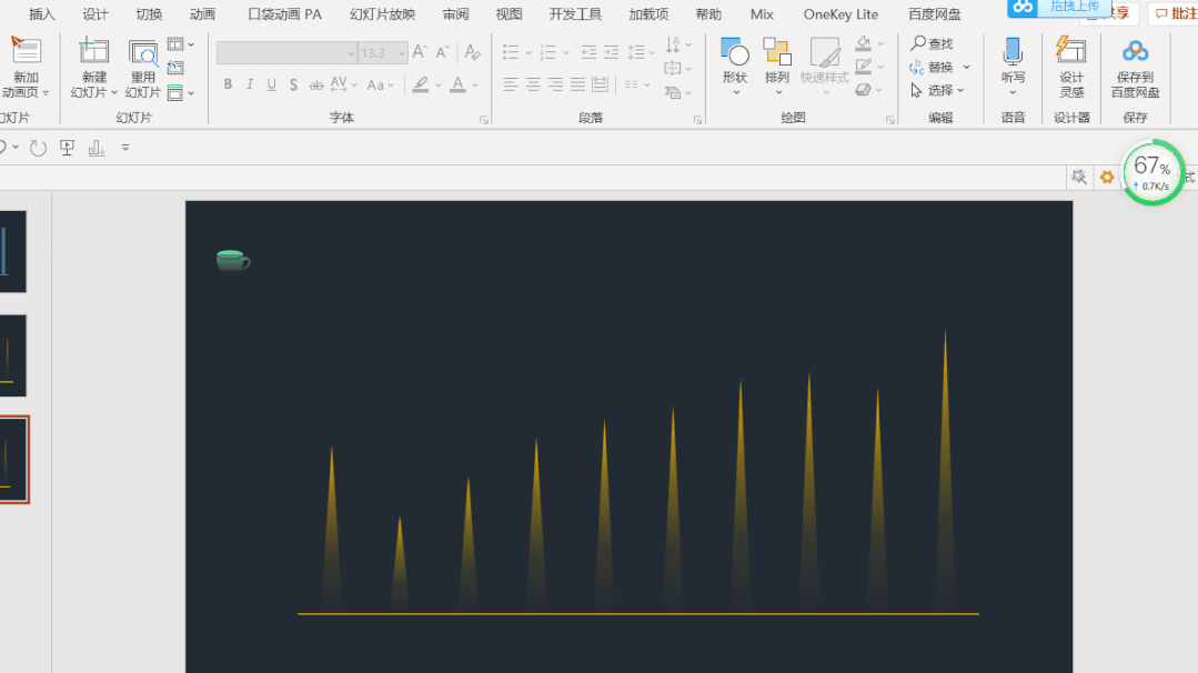
如果把填充色设置为渐变填充,效果立马就不一样

除了颜色填充,图片、形状都可以填充,比如填充为△

制作方法:在页面外侧插入一个渐变填充的△,然后先Ctrl+C复制这个三角形,再选中图表系列,Ctrl+V粘贴即可
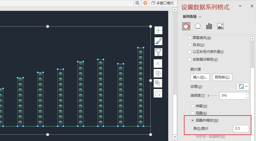
也可以填充图标

制作方法:比如用islide插件插入一个咖啡杯的图标,然后同样方法复制、粘贴。
这时候变成这样

然后要选中图表,鼠标右键-设置数据系列格式,勾选层叠并缩放,数值设置0.5(可根据实际调整)
二、条形图的美化
和柱状图类似,也是可以通过填充图标来达到不一样的效果
比如:原始这样一个条形图
可以通过Islide插件插入一个杯子的图标,通过复制粘贴得到

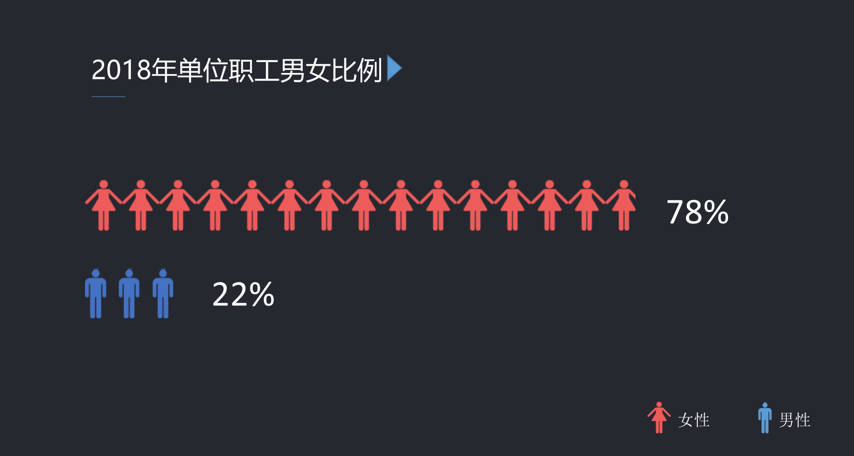
再比如还可以插入男性、女性的图标,再分别选中每个系列复制、粘贴
三、折线图
上述这种利用复制粘贴的方法,给图表填充图标等样式的,也可以适用于折线图
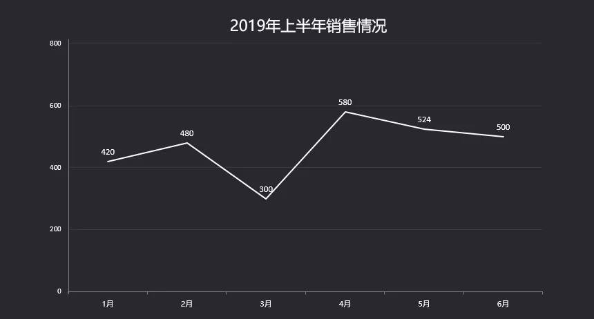
比如原始这样一个普通的折线图
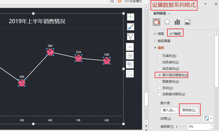
通过islide插件插入一个❀的图标,然后Ctrl+C复制这个图标
再选中图表系列,右键-设置数据系列格式,然后在标记中将填充方式设置为图片填充,图片源设置为剪贴板
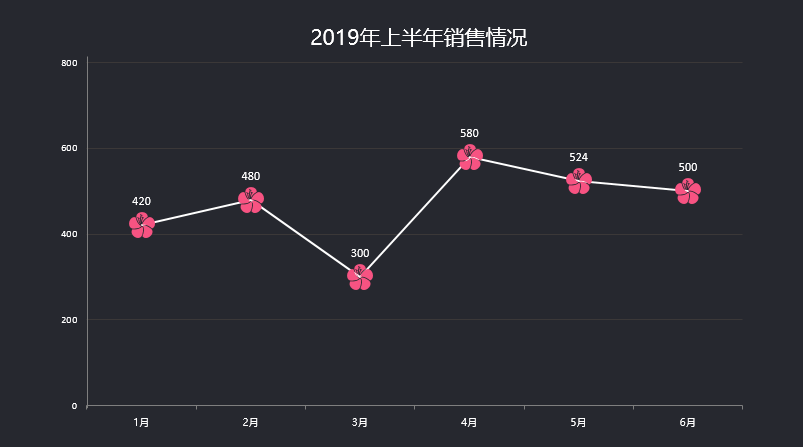
然后就可以达到这个效果
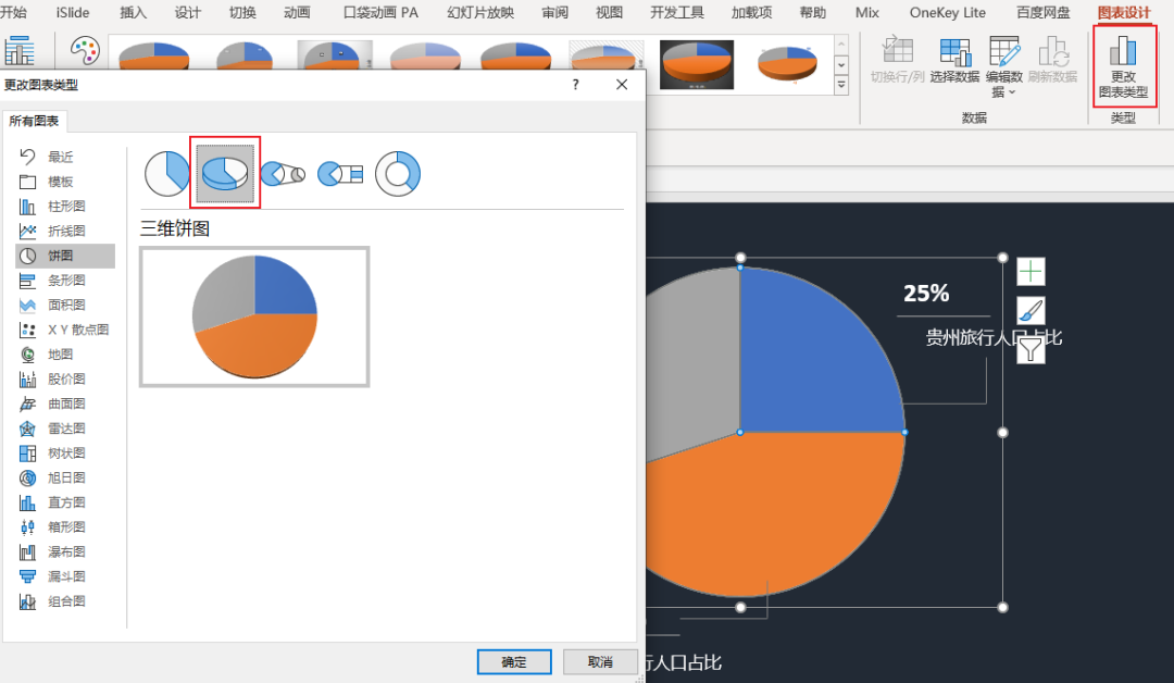
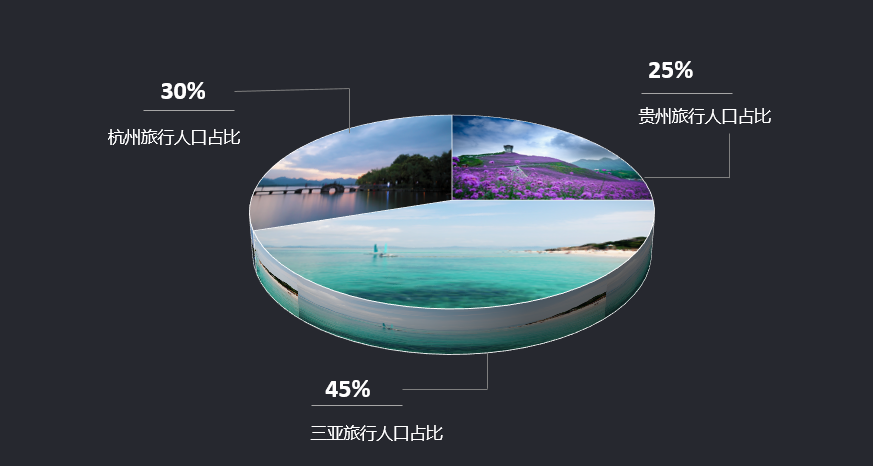
四、饼图的美化
在PPT中插入一个普通的饼图
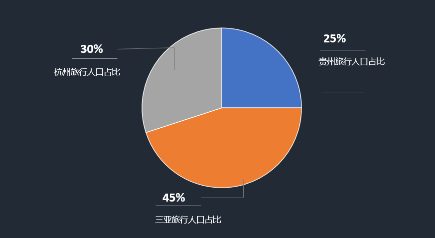
我们可以把二维转为三维,在更改图表类型里选择三维饼图
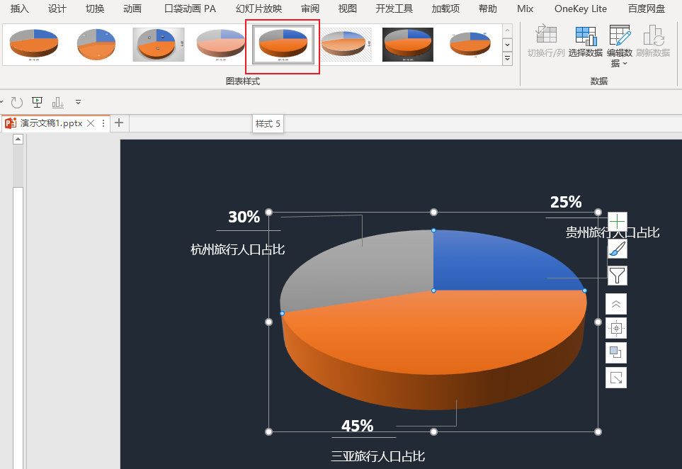
更改之后,立体效果还不好,可以在图表样式里套用样式5
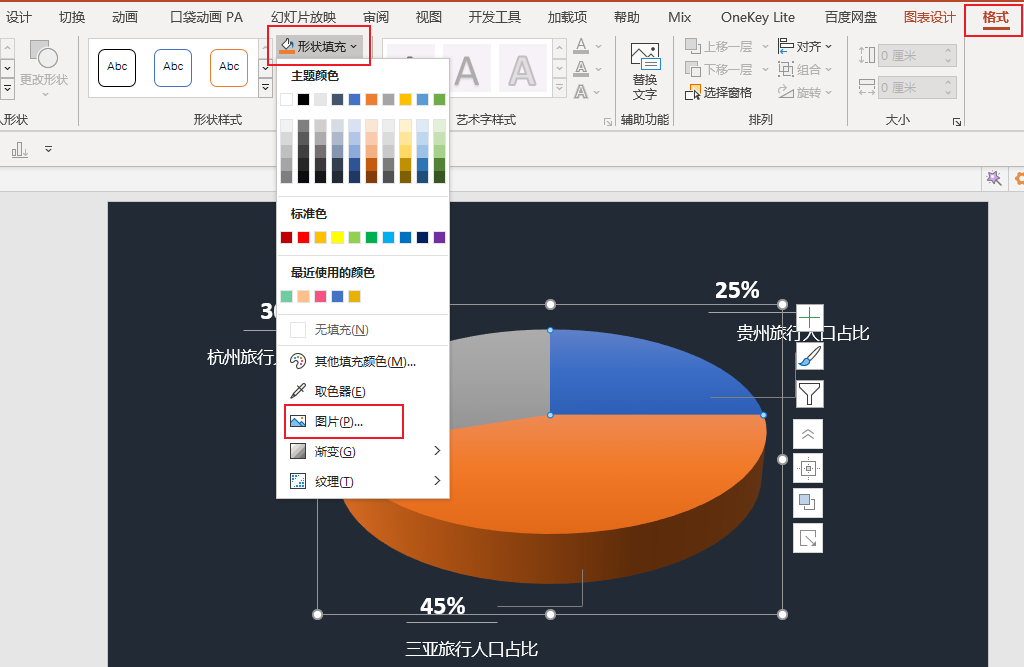
最后给饼图每一个单独的部分,填充不同的图片(可双击选中单独的每一部分)
即可达到这个效果
以上就是和大家分享的图表美化的一些小技巧,你学会了吗?
相关推荐
网络营销案例ppt模板及下载地址,看看大企业是怎么做网络营销的
文丨公关之家 作者:李姗 引言:网络信息时代,营销推广借助互联网和网络平台有了新的发展,企业要把握住机遇,必须要做好这一点。 当下各式各样的网络传播推广手段层出不穷,企业对于多元的…
市场营销案例ppt课件赏析,教你如何写出高质量营销PPT
本文分享的资料是《店面销售技巧》培训PPT,共108页,从案例分析到技巧知识,都是干货! 店面销售技巧,总览图,共108页 店面销售技巧,大纲,共7个小节 若需该份PPT源文件,请…
怎么设计创业计划书ppt,标准PPT模板分享
第668期:2018简约创意(互联网创业+商业计划书)模板PPT模板 ↓↓↓↓↓↓ 图片展示仅12页,完整图片共有25页 2018简约创意(互联网创业+商业计划书)模板 2018简…
营销策划ppt怎么做,产品营销策略ppt范例
转化能力、有效落地 请您关注,跪谢!为职场精英分享实用的营销工具。 实际的营销案例分享 苏宁红孩子北马体育营销创意方案 一、 创意概述 二、为什么选择北马体育营销? 三、如何借势话…
版权声明:本文内容由互联网用户自发贡献,该文观点仅代表作者本人。本站仅提供信息存储空间服务,不拥有所有权,不承担相关法律责任。如发现本站有涉嫌抄袭侵权/违法违规的内容, 请发送邮件至 举报,一经查实,本站将立刻删除。